map

What's Cookin'?

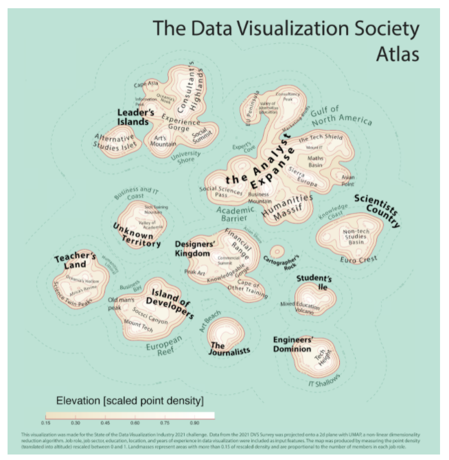
Created by: Sarah Emery Clark

A series of Data Illustrations exploring how education level affects one's career, using meal preparation as a visual metaphor. Being new to Data Viz I was excited to learn more about this community of thinkers, researchers and designers, and to discover what makes them tick. With that in mind, I focused my analysis on attributes that would help me to get a better sense of who’s in DataViz, what their career pathways look like, and their joys and frustrations along the way.

​Link to Visualization

The Data Visualization Society Atlas

Created by: Federico Comitani

A general overview of the DVS community in 2021 and how it changed. The data is presented as a cartographic map, with landmasses representing DVS members who gave similar answers to the survey. Four panels further focus on specific aspects: the level of experience of members is represented as a temperature map, their education is represented as territories, changes observed with respect to the 2020 survey are presented as migration flows; finally, a heatmap illustrates the most common tools and charts.

Link to Visualization

Knowing the Family

Created by: Mala Deep Upadhaya

A little explanatory and a little exploratory work which tries to find the answer of following questions: Who is the driving force behind the Dataviz community? Where do they live? Who motivates them to keep going? Which industries are they influencing with their expertise? How much time and effort do they invest in data visualization? Do they have DVS membership? and we'd want to meet them.

Link to Visualization

State of the Industry Survey Review

Created by: Penelope Privett

I have taken the 2020 and the 2021 survey results and compared the gender and location of the respondents against their preferences for tools, chart types and sharing channels.

The questions I've chosen to review were formatted as a "Select All That Apply" questions. I have compared the average number of options selected by the respondents, as well as the percentage of respondents that selected each option. Each of the comparisons show that the average number of tools, charts and sharing channels used have increased from 2020 to 2021 and that the most popular options from each question has not changed from year to year, but increased in usage.

The dashboard is also designed so that users can delve deeper into the results, by comparing smaller cohorts too see what their preferences are. For example, you could compare whether women living in Australia who use Excel have the same preference for bar charts as men who live in Sweden.

Link to Visualization

This is How We Viz

Created by: Amber Reed

An explanatory infographic based on results from the 2021 SOTI survey. The intent of this dashboard was to shine light on the individuals responsible for creating the data visualizations we know and love; answering the who, what, where, and why we do what we do. This dashboard was created in Tableau with considerations to accessible color palettes.

Link to Visualization

The 2021 DVIS: Broad Scope and Paths for Expanding Access

Created by: ADAM KORENGOLD

Based on data from the Data Visualization Society's 2021 Data Visualization Industry Survey, the practice of data visualization has been adopted on six of seven continents. across a range of disciplines and experience levels, which can be seen by mousing over each country to reveal pie charts showing disciplines and experience levels among respondents (where available). That said, adoption lags in much of sub-Saharan Africa, Latin America, and southeast and central Asia. As the practice expands, there will be greater opportunities to increase access to data visualization tools while celebrating country-level and cultural distinctions in information presentation preferences.

Link to Visualization