python

A matter of time: Linking job titles to data visualization tasks

Created by: Martina Dossi

1st place explanatory

The visualization focuses on the relationship between data visualization tasks and job titles in terms of dedicated time. It has been submitted as explanatory visualization given the presence of many plots showing overall trends and relationship that should guide the reader through the complete story. The purpose of the analysis is to investigate how different professional roles are related to data visualization tasks in terms of devoted time, answering question such as: 'is there any difference in how time is allocated to different activities between job titles?', 'which role spend more time in each task?', and 'what are the other tasks explicitly specified in the dedicated field?'.

​Link to Visualization

Are there coworkers like me?

Created by: Sarina Chen

Third place, explanatory category

Since the pandemic, people have been switching jobs to accommodate their change in routine, living situation, or life priorities. Whether it be in-person or remote, onboarding in a less social environment could feel pretty lonely. It's difficult to meet new people with similar interests. This graphic compares people in the workplace and identifies groups of people that have similar roles, years of experience, and industry.

Link to Visualization

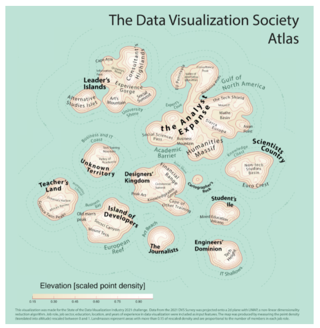
The Data Visualization Society Atlas

Created by: Federico Comitani

A general overview of the DVS community in 2021 and how it changed. The data is presented as a cartographic map, with landmasses representing DVS members who gave similar answers to the survey. Four panels further focus on specific aspects: the level of experience of members is represented as a temperature map, their education is represented as territories, changes observed with respect to the 2020 survey are presented as migration flows; finally, a heatmap illustrates the most common tools and charts.

Link to Visualization

Data Viz Roles' Salary and Gender Balance

Created by: Verena Schrader

When considering becoming a data visualization designer or switching roles within field, a question that comes into one's mind is how high is the earning potential. This question was the starting point for analyzing the data. Another goal was to evaluate gender balance.


The DVS Survey 2021 data has been used to create the visualization. The first part, the flowing sankey diagram, shows that salaries vary greatly, based on the different roles. The second half shows the percentage of women and men in the respective salary ranges. The amount of diverse data was too small to be shown in the diagram.


The result shows that the salary depends not only on the working field and role, but also on gender. The visualization illustrates that the balance is not yet finished. Although gender equality has made great steps forward in the past few years, one can see that there is still room for improvement.

The fonts and colors used in the diagram are accessibility tested and should also work for people having any kind of color blindness. Furthermore salary information from the survey results were summarized to ranges to make the chart easier to understand.

Link to Visualization

Show Me The Money

Created by: Matthew Osborne, PhD

Yearly salary is a crucial consideration for anyone considering a career field. The DVS annual census seemed like an excellent data source to explore this aspect of data visualization careers.

This particular graphic explores yearly salary as a function of gender and data visualization experience. While there are a larger number of women with a wealth of data visualization experience, for any experience level below 16-20 years the distribution of female salaries appears to be shifted slightly below that of men.

Link to Visualization

Why Do We Do Dataviz

Created by: Guillermina Sutter Schneider - Data Scientist

Many many times I have found myself late at night cleaning up some random dataset in order to create a data visualization about it. And I did it just for the enjoyment. Data visualization makes me happy and I could spend hours and hours doing it. From the very first sketch to picking the grain intensity of the canvas background or fixing the drop shadow, I enjoy every single step of it.

I have always wondered how other dataviz practitioners felt while creating a data visualization: do they also do it because they enjoy it? Do they do it to build a portfolio or to build a particular skill? These questions made me want to find out more about how many hours other people spend doing it and why they do it.

Link to Visualization