exploratory

Which DVS Persona Are You? (Quiz)

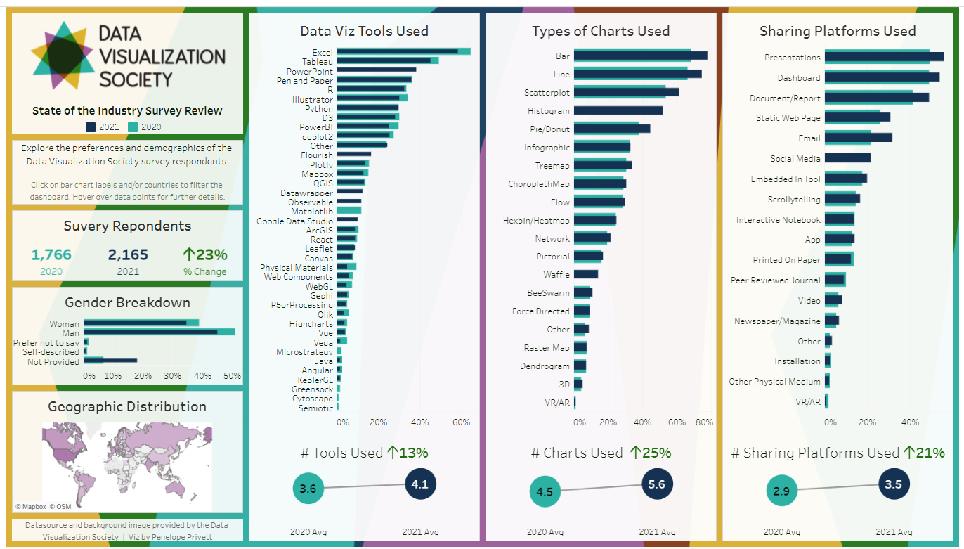
Created by: Joseph Ricafort

1st place exploratory

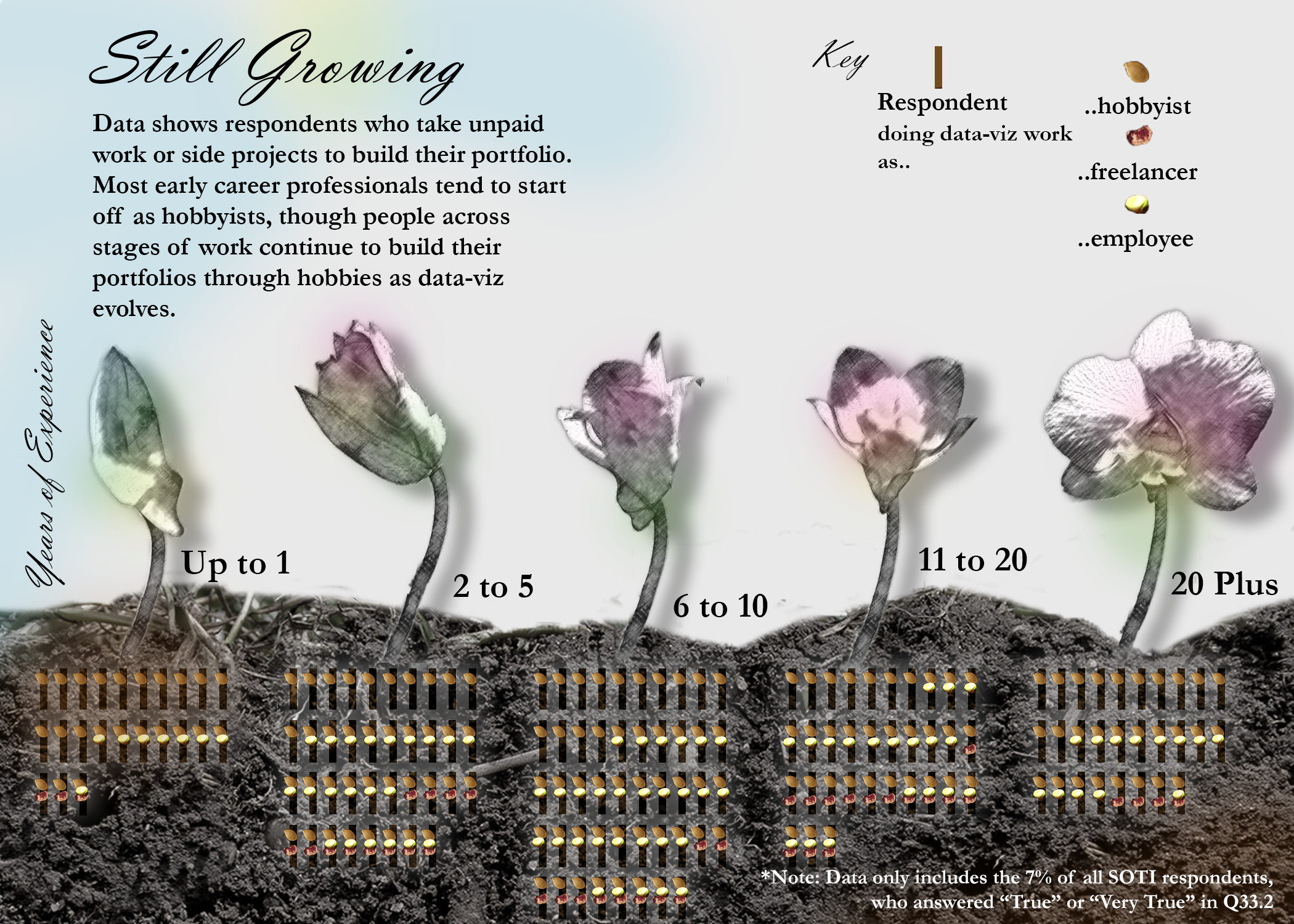
Which among the 16 DVS personas are you and what does it says about the majority of the personas who have the same persona as you? Four different variables (years experience, role, annual income, commitment), split into two leaning sides each, mixed-and-match and altogether resulted into 16 different personas! Which one are you? This Quiz will help you identify which persona are you the closest among the 16 unique DVS personas. It also describes how of you have the same persona and how common or rare your persona type is among the DVS community.

​Link to Visualization

Viz Heads

Created by:

The Odd Team: Ana Bertol, Ana Sifuentes, Bruno Lorenz, Francisco Estivallet, Gabriel Rezende, Leticia Pozza, Matheus Alves and Vitoria Valle

3rd place, exploratory

Viz Heads is an exploratory visualization to support answer the question: "I've started studying data visualization recently, who should I follow?" We've heard that question a million times, so to answer that, who better than the DataViz community itself? We've analysed the 2021 Dataviz Society State of the Industry Survey to find out the 429 different names, blogs, websites, books, and groups our viz peers consider to be HEADING the data visualisation field (pun intended).

Link to Visualization

How Do You Spend Your Data Viz Time?

Created by: Sandra Biller

Data visualization is more than the act of making charts. In addition to producing visualizations, time is spent on data preparation, analysis, and coming up with ideas. Then there’s a whole array of other tasks a data visualizer might do - writing code, teaching a class, or participating in the ubiquitous zoom meeting. Use this visualization to explore how different job roles spend their data viz time, and see where you fit in.

Link to Visualization

Tools and Charts

Created by: Sanjay Tambe and Nishant Nandardhane

The tools and charts section in the data visualization community survey, we have focused on addressing insights from three primary topics i.e., Technologies, Chart types and Representation mode used to create these visualizations.

Link to Visualization

Dataviz Practitioners Toolbox: 5 Years of DVS Survey Data

Created by: Anne-Sophie Pereira De Sá

4.7 is the average number of tools a dataviz practitioner uses according to the 2021 edition of the Data Visualization Society survey. Explore the most used tools and their trends over the 5 past years.

Link to Visualization

State of the Industry Survey Review

Created by: Penelope Privett

I have taken the 2020 and the 2021 survey results and compared the gender and location of the respondents against their preferences for tools, chart types and sharing channels.

The questions I've chosen to review were formatted as a "Select All That Apply" questions. I have compared the average number of options selected by the respondents, as well as the percentage of respondents that selected each option. Each of the comparisons show that the average number of tools, charts and sharing channels used have increased from 2020 to 2021 and that the most popular options from each question has not changed from year to year, but increased in usage.

The dashboard is also designed so that users can delve deeper into the results, by comparing smaller cohorts too see what their preferences are. For example, you could compare whether women living in Australia who use Excel have the same preference for bar charts as men who live in Sweden.

Link to Visualization

Exploring the DV Survey 2021

Realizado por/Created by: Erika Julieth Salcedo y Edgar Leonardo Camero Ortiz

Un proyecto pensado para explorar de manera interactiva la actividad de visualización en el mundo.

A project designed to interactively explore visualization activity in the world.

Link to Visualization

Still Growing

Created by: Yi Ning

The data-visualization explores who tends to take up unpaid data visualization work to build their portfolio. The initial motivation was to look at potential entry barriers into the data-visualization field by comparing younger professionals and their current data visualization roles with those who are older. Among those with up to 1 year of experience, more tend to be hobbyists. For the rest of the group, people who take up unpaid projects vary in the range of data-viz roles they identify with. The graphic shows counts of respondents in each age group who work on uncompensated data-viz projects to build their portfolios, with identifier markers to reflect their current involvement in data-viz.

Link to Visualization

The 2021 DVIS: Broad Scope and Paths for Expanding Access

Created by: ADAM KORENGOLD

Based on data from the Data Visualization Society's 2021 Data Visualization Industry Survey, the practice of data visualization has been adopted on six of seven continents. across a range of disciplines and experience levels, which can be seen by mousing over each country to reveal pie charts showing disciplines and experience levels among respondents (where available). That said, adoption lags in much of sub-Saharan Africa, Latin America, and southeast and central Asia. As the practice expands, there will be greater opportunities to increase access to data visualization tools while celebrating country-level and cultural distinctions in information presentation preferences.

Link to Visualization