


Created by: Michael Berry
A light hearted approach to representing some of the interesting data from the SOTI survey

A light hearted approach to representing some of the interesting data from the SOTI survey
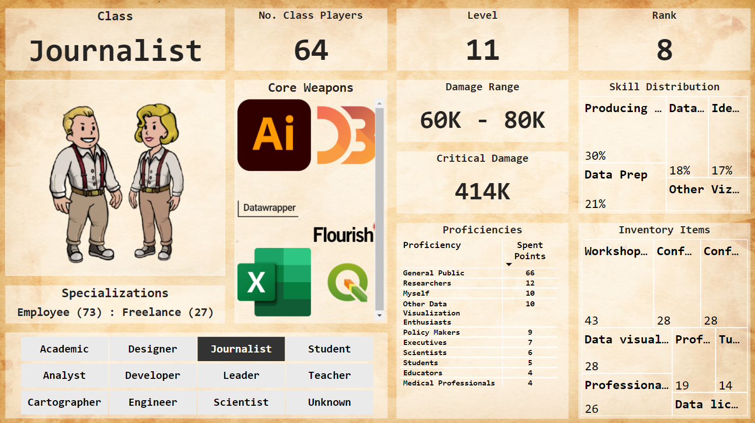
A little explanatory and a little exploratory work which tries to find the answer of following questions: Who is the driving force behind the Dataviz community? Where do they live? Who motivates them to keep going? Which industries are they influencing with their expertise? How much time and effort do they invest in data visualization? Do they have DVS membership? and we'd want to meet them.

4.7 is the average number of tools a dataviz practitioner uses according to the 2021 edition of the Data Visualization Society survey. Explore the most used tools and their trends over the 5 past years.
