Why Do We Do Dataviz

Created by: Guillermina Sutter Schneider - Data Scientist

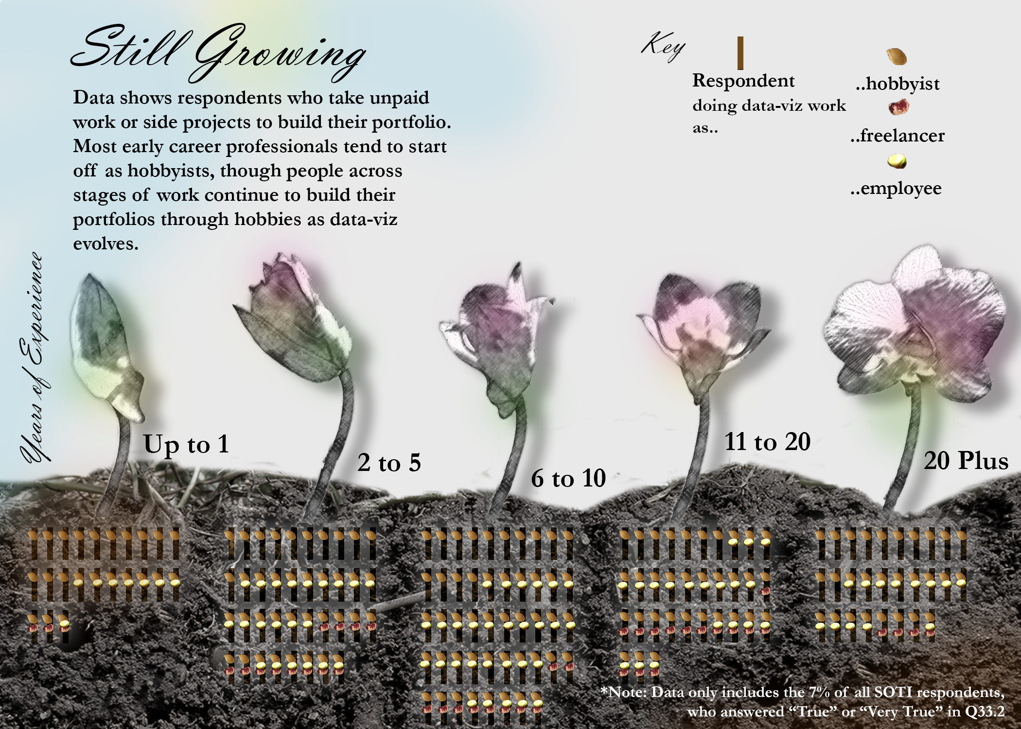
Many many times I have found myself late at night cleaning up some random dataset in order to create a data visualization about it. And I did it just for the enjoyment. Data visualization makes me happy and I could spend hours and hours doing it. From the very first sketch to picking the grain intensity of the canvas background or fixing the drop shadow, I enjoy every single step of it.

I have always wondered how other dataviz practitioners felt while creating a data visualization: do they also do it because they enjoy it? Do they do it to build a portfolio or to build a particular skill? These questions made me want to find out more about how many hours other people spend doing it and why they do it.

Link to Visualization

State of the Industry Survey Review

Created by: Penelope Privett

I have taken the 2020 and the 2021 survey results and compared the gender and location of the respondents against their preferences for tools, chart types and sharing channels.

The questions I've chosen to review were formatted as a "Select All That Apply" questions. I have compared the average number of options selected by the respondents, as well as the percentage of respondents that selected each option. Each of the comparisons show that the average number of tools, charts and sharing channels used have increased from 2020 to 2021 and that the most popular options from each question has not changed from year to year, but increased in usage.

The dashboard is also designed so that users can delve deeper into the results, by comparing smaller cohorts too see what their preferences are. For example, you could compare whether women living in Australia who use Excel have the same preference for bar charts as men who live in Sweden.

Link to Visualization

Data Viz Society Influencers

Created by: Jasna Dishlieska Mitova

Frequently seeking inspiration myself, I decided to focus this visualisation on the data viz go-tos in our society based on the DVS Annual Survey 2021. This visual shows the 15 most influential people and non-generic resources based on the number of mentions in the survey. If 15 is not enough to get you inspired, there is the extensive list of everyone mentioned as well.

Link to Visualization

This is How We Viz

Created by: Amber Reed

An explanatory infographic based on results from the 2021 SOTI survey. The intent of this dashboard was to shine light on the individuals responsible for creating the data visualizations we know and love; answering the who, what, where, and why we do what we do. This dashboard was created in Tableau with considerations to accessible color palettes.

Link to Visualization

What's Stopping Us?

Created by: Creater

Question 38 of this years survey asked, ‘What current or recent barriers have you faced in getting into data visualization professionally?’, to participants who had less than 5 years experience, this was done ‘…in order to focus on early-career and new-to-field challenges.’ Participants were given a free text field to state the barriers they faced and after combing through those I categorized them into 14 themes that summarized the main areas that people experienced difficulties in and highlighted some additional findings.

Link to Visualization

Exploring the DV Survey 2021

Realizado por/Created by: Erika Julieth Salcedo y Edgar Leonardo Camero Ortiz

Un proyecto pensado para explorar de manera interactiva la actividad de visualización en el mundo.

A project designed to interactively explore visualization activity in the world.

Link to Visualization

Why We Visualize

Created by: Ilena Peng

Many online data visualization communities center around personal projects and challenges, like #TidyTuesday or this annual Data Visualization Society challenge. These works are created on one’s own initiative, without any outside pay. According to DVS' 2021 State of the Industry survey, the top two reasons for pursuing unpaid side projects were to build skills and for enjoyment.

In the survey, respondents were given five phrases and asked to identify how much each phrase reflected their motivations for doing unpaid side projects. This graphic shows the responses of 239 DVS members, with color corresponding to how much they resonated with each phrase and size corresponding to the number of people who answered as such.

Link to Visualization

Still Growing

Created by: Yi Ning

The data-visualization explores who tends to take up unpaid data visualization work to build their portfolio. The initial motivation was to look at potential entry barriers into the data-visualization field by comparing younger professionals and their current data visualization roles with those who are older. Among those with up to 1 year of experience, more tend to be hobbyists. For the rest of the group, people who take up unpaid projects vary in the range of data-viz roles they identify with. The graphic shows counts of respondents in each age group who work on uncompensated data-viz projects to build their portfolios, with identifier markers to reflect their current involvement in data-viz.

Link to Visualization

Getting the Word Out

Created by: Lisa Vissichelli

Data visualizations are gaining popularity and industries are demanding a wider range of ways to get the word out. This year’s DVS census shows that industries are evolving how they share data visualizations. Of the top three communication methods, Dashboards, Presentations and Document or Report emerged as the highest use cases. This graphic illustrates how industries prefer communicating data visualizations by method.

Link to Visualization

The 2021 DVIS: Broad Scope and Paths for Expanding Access

Created by: ADAM KORENGOLD

Based on data from the Data Visualization Society's 2021 Data Visualization Industry Survey, the practice of data visualization has been adopted on six of seven continents. across a range of disciplines and experience levels, which can be seen by mousing over each country to reveal pie charts showing disciplines and experience levels among respondents (where available). That said, adoption lags in much of sub-Saharan Africa, Latin America, and southeast and central Asia. As the practice expands, there will be greater opportunities to increase access to data visualization tools while celebrating country-level and cultural distinctions in information presentation preferences.

Link to Visualization