Created by: Pere Rovira, founder and data product manager at OneTandem, and Rosanne Kruithof, data visualization developer at OneTandem
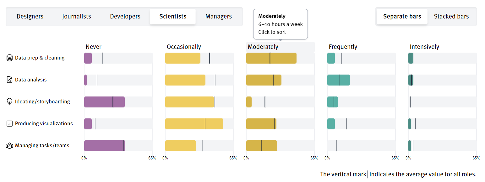
We created a website to explain the kind of tasks that data visualization professionals perform on a typical week, based on the results to Q53. We analyze the differences across tasks, as well as across professional roles. Finally, we categorize and visualize the open text questions, to understand the "other" type of tasks. The website's interactive features are best experienced on desktop, but we also created a specific mobile version with reduced functionality, to ensure the optimal user experience across devices. We designed the website following the DVS logo colour palette, to link our work to the DVS.


