How data visualization professionals spend their time?

Created by: Pere Rovira, founder and data product manager at OneTandem, and Rosanne Kruithof, data visualization developer at OneTandem

beautiful badge

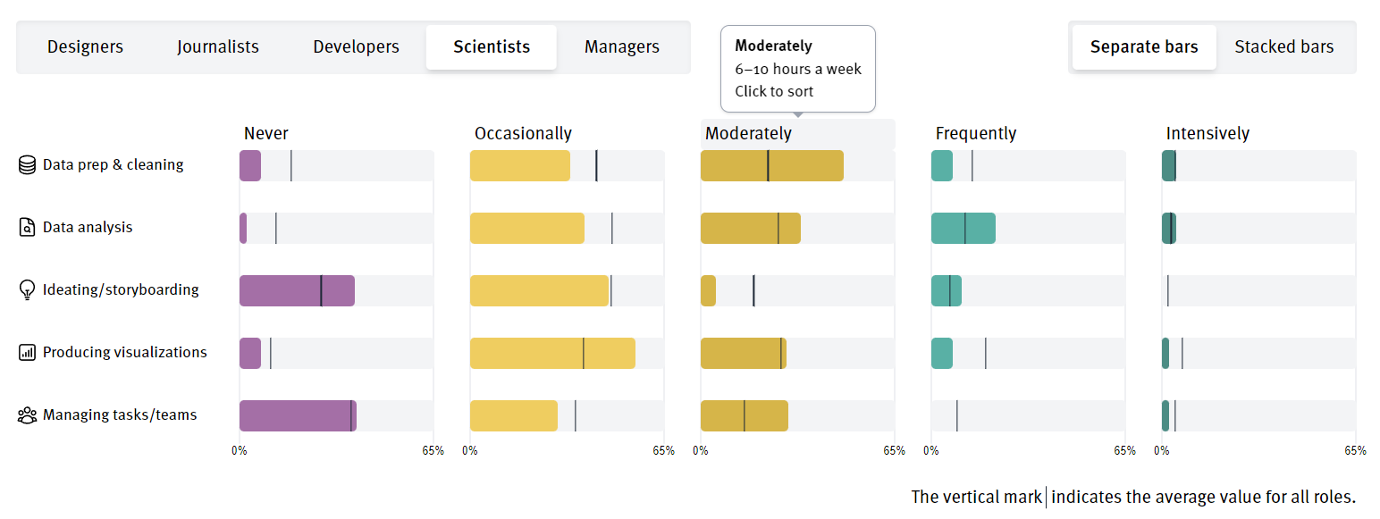
We created a website to explain the kind of tasks that data visualization professionals perform on a typical week, based on the results to Q53. We analyze the differences across tasks, as well as across professional roles. Finally, we categorize and visualize the open text questions, to understand the "other" type of tasks. The website's interactive features are best experienced on desktop, but we also created a specific mobile version with reduced functionality, to ensure the optimal user experience across devices. We designed the website following the DVS logo colour palette, to link our work to the DVS.

Tools of the Trade

Created by: Steinar Shellenberger

My project is based on exploration of how remote work takes place in data viz community. This analysis is based on SOTI'22 and offers insights into:

  • How is the global data viz workforce distributed

  • The roles people have adopted and impact of remote work on their compensation

  • The tools and resources that are aiding the data viz workforce

  • The struggles people see coming from remote work

DataViz Confessions

Created by: Hamsa and Arpit from 36truths

Behind every captivating data visualizations lies the story of a skilled practitioner who meticulously crafted that story out from raw data. This project is our attempt to delve into the narratives of these practitioners, unveiling their journeys, inspirations, and the challenges they encounter along the way.

We have arranged the stories of these practitioners into three key components:

The Confession: Stories of individual dataViz practitioners and the challenges they faced while working with other people on data visualizations.

The Individual: Details around the role and geographical location of the data viz practitioner confessing their experiences.

The Data: Supporting statistics for each of the confessions featured, highlighting how many other survey respondents confessed similar challenges.

As you explore these three key components, you will be immersed in the rich tapestry of experiences that data visualization practitioners encounter daily. Each story provides a unique glimpse into the intricate process of transforming raw data into captivating visual narratives.

By highlighting these stories, we seek to create an immersive experience for the reader and seek to foster a sense of connection and empathy, emphasising the journeys taken by practitioners (both confessors and reader) and around the world while creating beautiful work.

Pirouette Table: a fancier (but perhaps less useful) Pivot Table

Created by: Daniel Lewis

Survey results are hard to analyse. There are big picture statistics, but every response has an underlying human story. This "Pirouette Table" intends to strike the balance between the global context and the individual response. It enables pivoting across various variables, then zooming in on full profiles of respondents with certain characteristics, and then zooming back out to the bigger picture. It offers a whirling tour of individual and group responses... Let's pirouette.

Visualizing Data: From Novice to Master, the Struggle is Real

Created by: Arielle Kan

This visualization aims to illustrate the challenges across data viz practitioners with different levels of expertise, showing the common challenges as well as those that changes with years of experience, and a special poem dedicated to the newcomers of the field.

Who Inspires Us?

Created by: Declan Bradley

Every year, the Data Visualization Society publishes a State of the Industry survey on the work of data visualizers around the world. In this year's survey, the more than 1,500 respondents were asked, "Who do you find helpful for inspiration in data visualization?"

These are their answers.

Respondents named more than 700 individuals, organizations, and resources that inspire them — visualized here as a network of collaboration that supports the data visualization community.

For inspirers, represented in black, node size represents the number of respondents who listed them as an inspiration, while for respondents, node size represents reported years of experience in data visualization. Color, meanwhile, represents respondents' roles at their places of employment, if applicable.

Data Visualization Technologies: usage frequency and user preferences explored

Created by: Anca Sarb

This project is an exploration into the tools and technologies data visualizers are currently using and what they want to use, highlighting the most popular tools with large communities and their extent of usage as well as ranking the most loved and wanted tools plus the most dreaded ones by the community.

Remote Work in data viz community

Created by: Kanchan Ishwar

My project is based on exploration of how remote work takes place in data viz community.This analysis is based on SOTI'22 and  offers insights into:

  • How is the global data viz workforce distributed

  • The roles people have adopted and impact of remote work on their compensation

  • The tools and resources that are aiding the data viz workforce

  • The struggles people see coming from remote work

screenshot of bar chart about how much time remote workers spend on data viz

What are the most frequently used Data Visualization Tools?

Created by: Rachel E Cinelli

The dashboard displays the Tools that most data visualizers use, how they rate the tools, and with what frequency they use them. Demographic charts are included as filters so that users can explore how this stacking changes by Geography, Years of Experience and Role.

Tools and Charts We used for Dataviz

Created by: KeyEun Lee, Freelance Data Visualization Designer

What charts and tools do people in what roles use most often? This project was born out of the above question, and I created a heatmap that shows the distribution of charts and techniques used by respondents based on their roles. I generated descriptions for each chart and technique using GPT-4, and displayed the descriptions in a modal window when clicking on a cell in the heatmap. Enjoy the website!

Evolution of Data Viz Tools (2017 - 2022)

Created by: Kelsey Nanan

While the DVS SOTI survey has been fine-tuned over the years, a few questions have been consistently asked, allowing us to look at the evolution of certain aspects of this blossoming field. This visualization presents the evolution of tools & technologies reported used by data viz practitioners from 2017 to 2022. What tools are used most each year? Which has gained/declined most in popularity over time? How has a specific tool's usage changed over time? By sorting & hovering on this visualization, we can find the answers to these questions and more. In essence, this can be thought of as a dynamic data portrait of the DVS, as seen through the lens of the tools we use for our craft.

State Of The Industry Survey Results 2022

Created by: Viktoriia Vasiukova

There are 1404 squares on the screen — each one represents a SOTI response. The viz is inspired by a minesweeper game, only here the similar squares get flipped when you click on one of them, and no mines are involved. It is an attempt to look closer at each response while getting the broader picture as well. The viz can be viewed only on desktops.