
Julia Janicki (http://juliahanjanicki.com/) and Sylvia Janicki (https://sylviahjanicki.com/)

DESCRIPTION
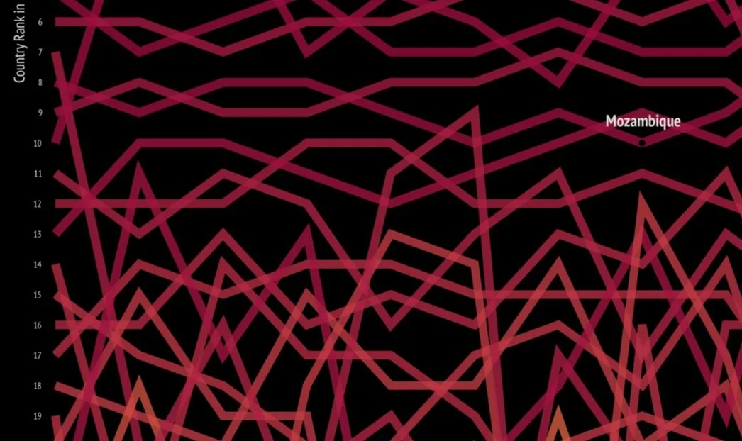
Global fire patterns are visualized based on NASA's FIRMS data, focusing on MODIS only and not VIIRS. The MODIS satellite take a ‘snapshot’ of events as it passes over the earth and each active fire detection represents the center of a 1km pixel flagged as containing one or more fires. This visualization can inform us which countries and what time of the year fires most frequently occur by visualizing the fire counts by month and year, fire counts by country by year, and country rankings by year. Why do certain countries have so many fires? Causes can be related to climate conditions, agricultural practices, volcanoes, and more. Many fire events over the past decade have lead to deforestation in many regions, from the Amazon to the Congo basin to Indonesia.
PROCESS
The yearly MODIS fire detection csv data was first downloaded, it included fields such as date, latitude and longitude. A python script was written (using libraries including pandas and numpy) to assign each location to a country and count the number of fires by country and by month. There were over 40 million total records of fire detection, so multiprocessing was also used in the python script. Once the data was ready, the main visualizations were created with D3 and ScrollMagic.