

CREATED BY: Barbara Donnini - Boxplot Analytics
DESCRIPTION:
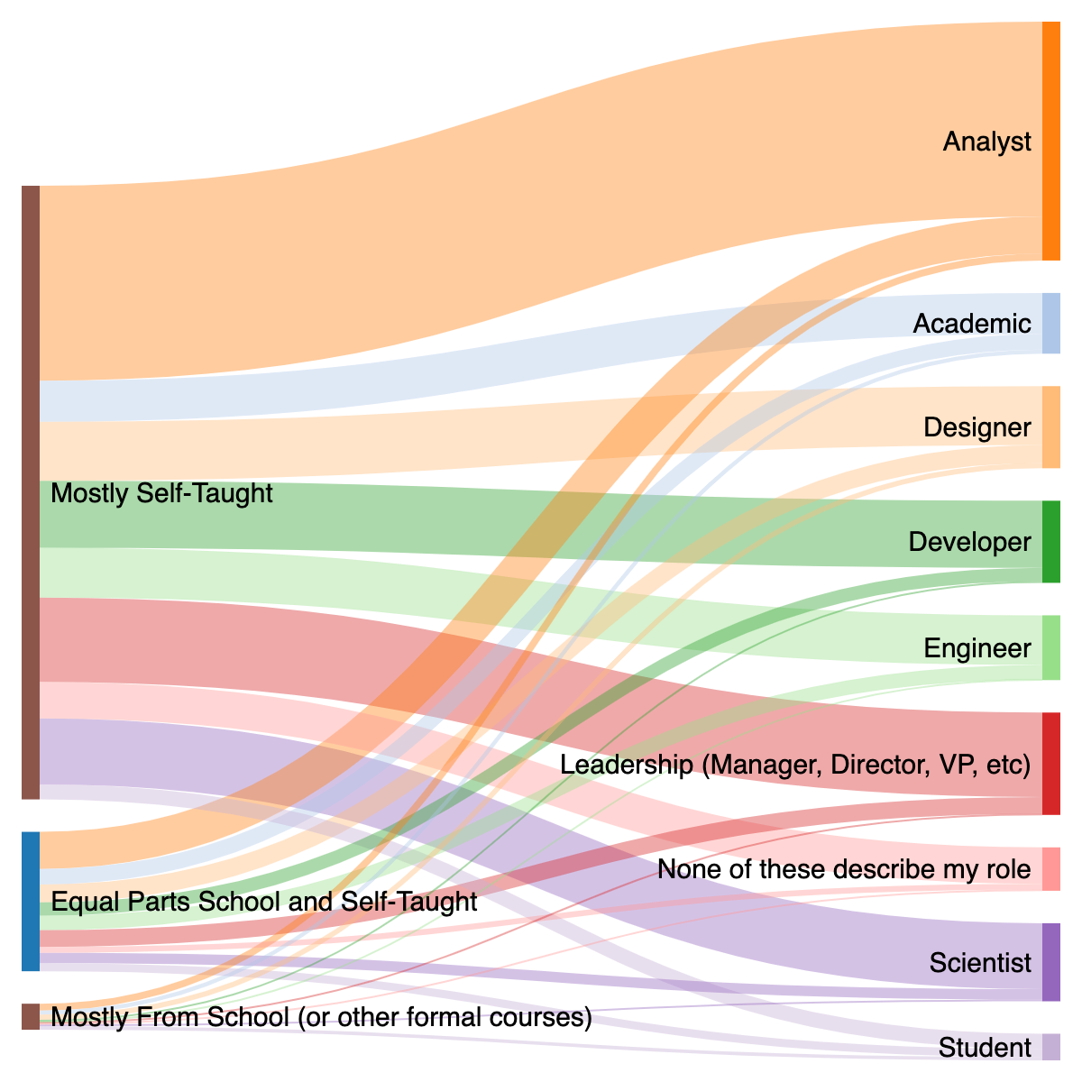
This basic Sankey diagram shows the flow of survey respondents, starting from their current level of education in data analysis. The beauty of a Sankey diagram is that you can glean several pieces of information at once. Right from the start we can see that the vast majority of respondents are self-taught (it's the largest "node" on the left side). From there, we see that the majority of self-taught data professionals become "Analysts". Our eye might then realize that the majority of data professionals from *each* category also go on to be "Analysts", it's just lower numbers from the "Equal Parts" and "Mostly School" categories. The diagram offers a high-level view of the general industry/career path of the respondents, but also a decent breakdown by the categories of the two variables.
PROCESS:
I cleaned and analyzed the data in Python. I also set up the data in the format required to generate the Sankey diagram in Python. I then pasted the data into an online generator because I was displeased with the options I was generating with a Sankey library and MatplotLib in Python. The site I used (http://sankeymatic.com/build/) was based on D3. While I do know JavaScript, I used the generator to save time.